Text Heights in Structural Drawings
Good text heights makes a legible drawing. Too small, and it’s difficult read. Too large, and it is a struggle to fit all the information in.
A drawing is more representable if the same text height is used. For example: all notes and dimensions should be the same height. Likewise title text should also be consistent.
In CAD environments, normally everything is drawn at 1:1. For example a plate 250mm long would be drawn, in CAD, 250mm long. However, since most items drawn are eventually presented in paper format, a suitable scale should be selected. This does not effect the line work, but does effect the text. Choosing the right one can be expressed in a simple formula:
Drawing Scale x Suitable Text Height at 1:1 = CAD Text Height
Therefore, the standard text height in a 1:10 drawing would be 25mm OR 10 x 2.5 = 25. A 1:250 drawing would use 625 high text OR 250 x 2.5 = 625. Got it?
Also selecting a suitable pen or line weight requires close attention. Half scale prints, A1 to A3 for example, are very common and too thick a pen weight would make the text illegible. Of cause this does not apply to True Type Fonts, as line weight is already built in. Examples of this would be Arial or Times New Roman fonts.
National standards bodies like ANSI, ISO, BS, JIS, AS/NZS publish documents on text height standards.
Standard Metric Text Heights (1:1)
| Height at 1:1 | Usage | Pen Weight |
| 1.8mm or 2.0mm | Use sparingly and only when the standard text height just won’t fit. | 0.25mm |
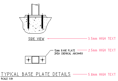
| 2.5mm | The standard, general purpose, text height. Example: dimensions, notes etc. | 0.35mm |
| 3.5mm | Secondary titles. Example: SECTION A-A. Also used in schedule or table titles. | 0.5mm |
| 5.0mm | Primary titles. Example: TYPICAL FLY BRACE DETAIL | 0.7mm |
| 7.0mm | Big titles, rare to use in the actual drawing space, but commonly used in cover sheet titles, or in the title block text. | 1.0mm |